Project Overview
Ordering pizza for a large group can quickly become chaotic—especially when dietary requirements, individual preferences, and the challenge of splitting the bill come into play. This app was created to solve exactly that: making group pizza orders simple, inclusive, and hassle-free.
Objectives
The app helps users find nearby pizzerias that cater to their dietary needs, offering a clear, visual comparison of reviews to support informed decision-making. It simplifies the group ordering experience by allowing each person to add their own items to a shared cart from their own phone. Once everyone has added their order, the app makes it easy to split the bill evenly or by item.

.png)
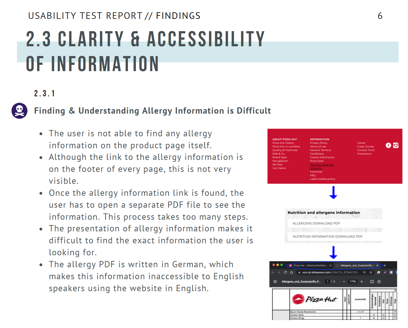
-6.png)