University Teacher's Association
End-to-end redesign of website & member portal
Project Overview
This client needed a full website overhaul—from their public-facing site to a gated member-only platform. Their existing website was outdated, lacked clear structure, and no longer reflected their mission, vision, or advocacy initiatives. The most complex part of the engagement was navigating internal alignment, which led to ongoing shifts in project scope.
Objectives
• Improve the site’s information architecture

• Redesign the website to feel more modern and dynamic

• Build a gated member portal from scratch

• Design and implement a seamless membership application and renewal process. 
User Research
STEP 1
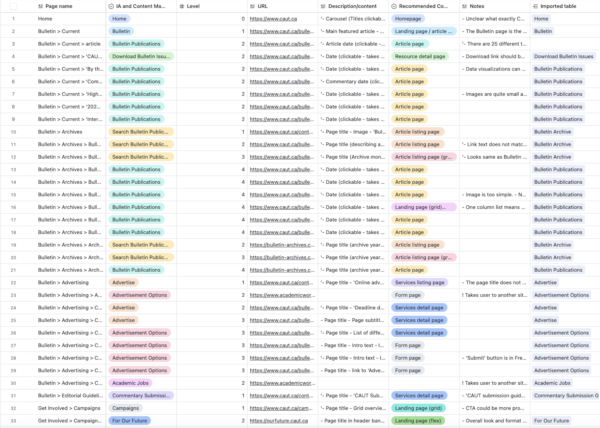
Full Content Inventory & Audit
I began with a detailed audit of every piece of content on the client’s website. Each item was cataloged to assess content types, usage, gaps, and redundancies.

From there, I worked with the client to identify what would be retained, reworked, or removed.
STEP 2
Discovery Workshop: Content Management System
Using Miro, I facilitated a two-part CMS discovery workshop. Session one introduced workshop goals and walked stakeholders through the structure of the workshop.

I invited them to add input asynchronously, and in session two, we synthesized the feedback with an affinity mapping exercise. This helped surface core pain points and requirements for content governance.
STEP 3
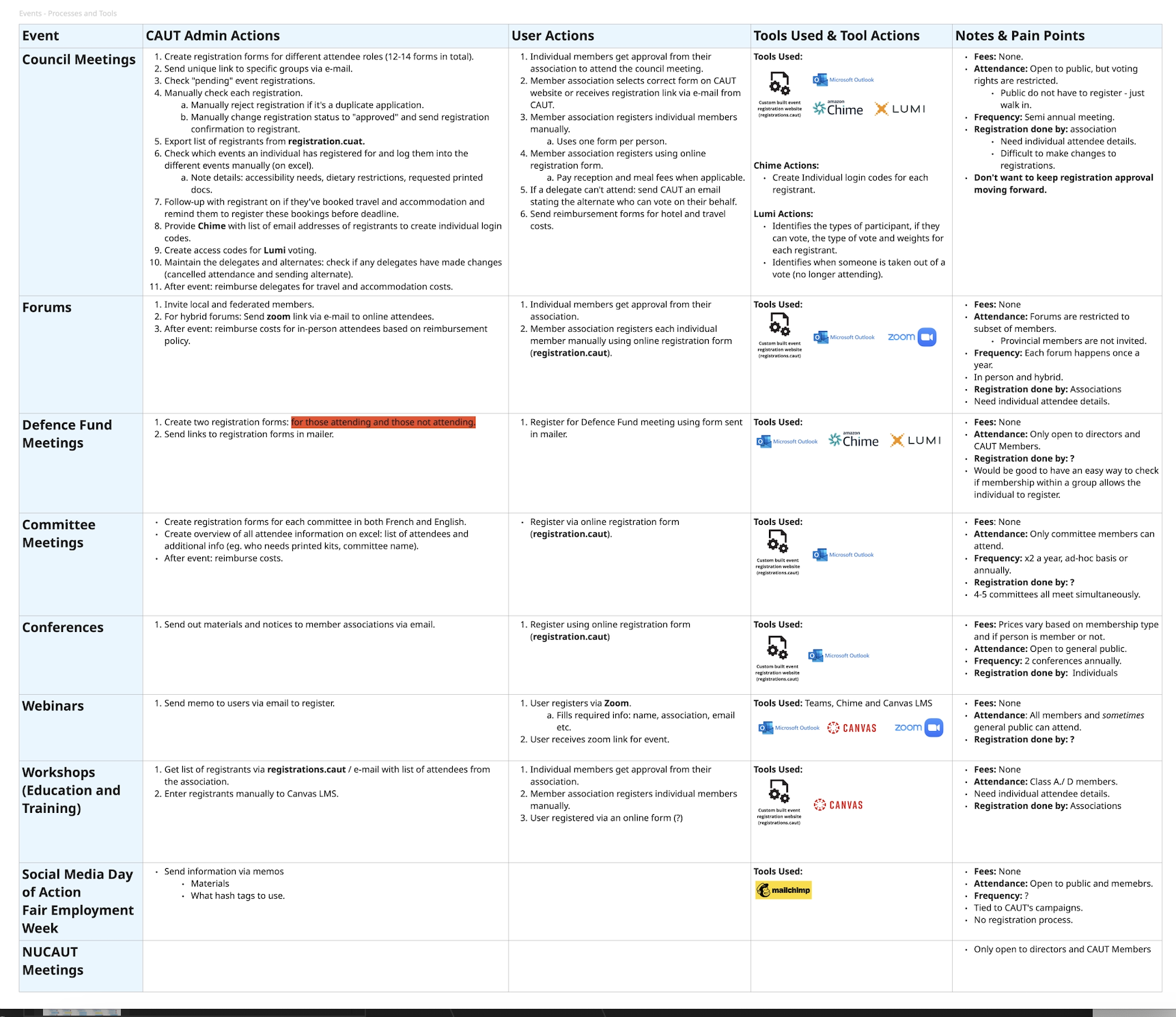
Discovery Workshop: Events & Ecommerce
The client initially wanted to centralize event management on the new website. However, discovery surfaced complexity in their workflows that couldn’t be addressed with a single tool within scope.

I recommended and validated a hybrid solution using WordPress and plugins like Events Calendar Pro, and an external platform for larger events to meet both technical and budget constraints.
STEP 4
Discovery Workshop: Membership Onboarding & Renewal
The organization had no web-based process for membership onboarding or renewals. Their membership tier system was overly complex, with contradictory documentation across internal teams. I worked closely with stakeholders to consolidate and simplify the tiers, effectively taking on a business consulting role. The goal was to streamline the user experience while minimizing staff intervention in day-to-day membership processes.
STEP 5
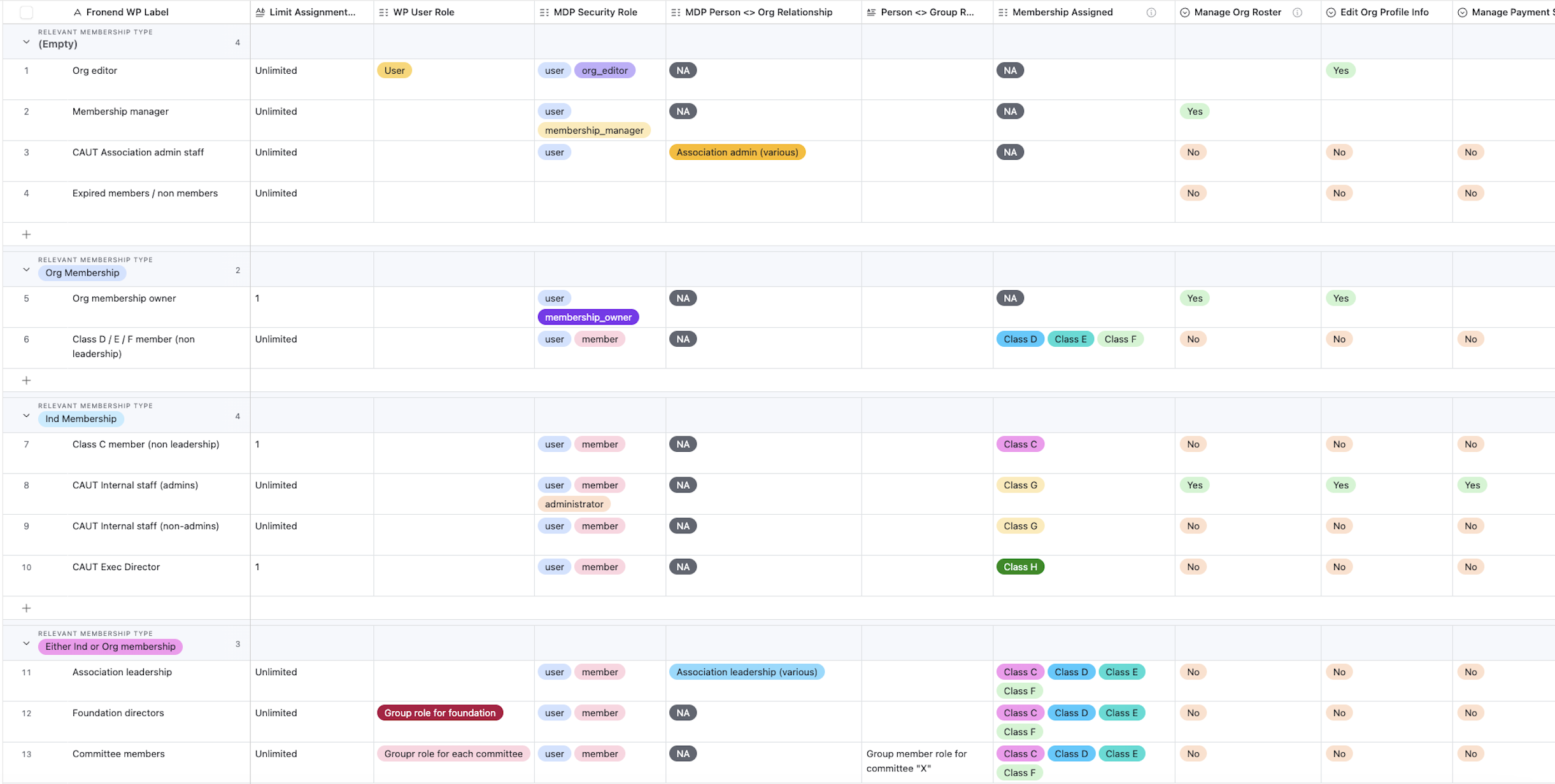
Discovery Workshop: Member Roles & Access Levels
The existing site lacked a gated member area. Even after simplifying the membership tiers, granular permissions for resources and tools still required careful planning. Aligning stakeholders on access rules was one of the most time-consuming parts of the project and required multiple working sessions to get right.
UX Design
STEP 6
Discovery Findings Client Presentaiton
I translated discovery insights into clear design principles, presenting these to the client for sign-off before any design work began. This ensured alignment on direction and helped manage expectations.
STEP 7
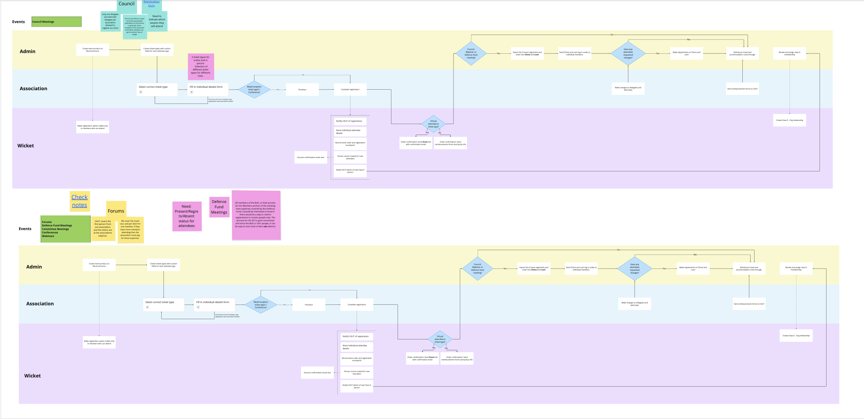
User Flows
I created user flows for the most critical tasks, with special attention to the complex membership application journey.

Flows were created for:

• Membership signup and renewal

• Event registration
STEP 8
Information Architecture
Building the IA was a balancing act between good UX and organizational priorities. The diversity of content types and need for archival content made the process complex. Multiple iterations were needed to land on a structure that worked for both users and admins.
STEP 9
Taxonomy & Vocabulary Planning
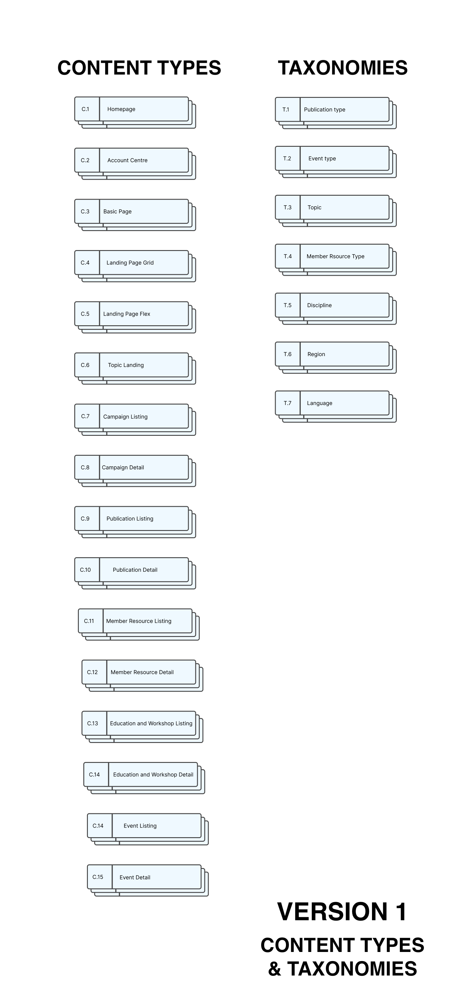
I developed a taxonomy system to help admins ease the process of organizing content and to make it easier for users to find content of interest. 
STEP 10
Wireframes
Wireframes were designed for all major pages and flows.

Wireframes were designed for:

• Membership application and renewal

• Member portal

• Homepage

• Publications

• Events
STEP 11
Mockup Review
Mockups developed by our visual designer—based on my wireframes—were reviewed by me to ensure consistency with UX goals and discovery insights.
Development & Launch
STEP 12
Developer Handoff
I wrote detailed acceptance criteria in plain language, with edge-case handling and pseudocode where needed. I also walked the developers through the designs and documentation to support a smooth implementation.
STEP 13
User Acceptance Testing & Bug Tracking
As features were developed, I tested each against the acceptance criteria, flagging bugs and working closely with the dev team until all features met expectations and were ready for QA.
Reflections
Scope, scope, scope! A project can easily expand without clear boundaries. One of my biggest takeaways was the importance of addressing scope changes early and being assertive about how these shifts impact timelines and workload across all projects in flight. When scope does expand, every dependent timeline should be recalibrated to reflect the added complexity.